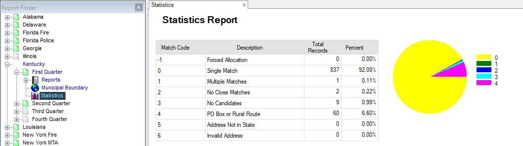
The Allocation Statistics report consists of four pie charts. The first chart breaks down total policies per Match Code. A higher percentage of single and multiple matches indicates that the addresses provided are good addresses.
The second chart is a breakdown of policies based on the precision of the latitude and longitude coordinates.
Some match addresses have more precise coordinates than other addresses (See Appendix E). The third chart indicates the percentage of taxable and non-taxable premiums. The fourth chart lists the eight premium types and the amount of premiums for each type.
Match Code Distribution: The pie chart list the percentage of policies by match code. A higher percentage of addresses assigned a match code 0 or 1 is best.
Match Identifier Distribution: The second chart is a breakdown of policies based on the precision of the latitude and longitude coordinate. The pie chart list the percentage of policies by match identifier. The match identifier chart lists the precision of coordinates assigned to each address. S3, S5, S7, and S8 represent more precise locations. S1, S2, and S3 represent less precise locations. Some match addresses have more precise coordinates than other addresses (See Appendix E).
The third report indicates that number of premiums determined to be taxable versus non-taxable.
The fourth chart lists the eight premium types and the amount of premiums for each type.